A strong brand is more than a good-looking logo. It is the visual and verbal system that helps people understand who you are, what you offer, and why it matters.
This collection highlights brand identity, packaging, promotional, and digital design work led by Miladys Cruz-Fisher, founder and creative director of iSpeak CREATIVE. The work reflects the foundation of iSpeak CREATIVE’s expanded agency model, where thoughtful design, clear messaging, and real-world usability work together to support a stronger brand presence.
Phase 2 Phase Strategy
Lake Tahoe, NV
DESIGN CHALLENGE / SOLUTION / OUTCOME
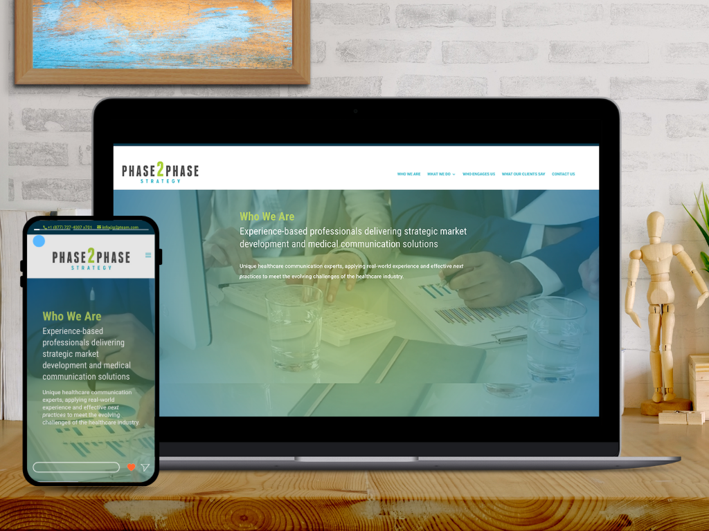
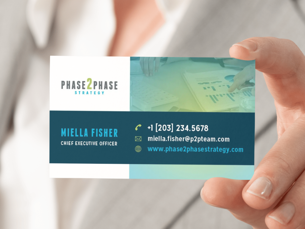
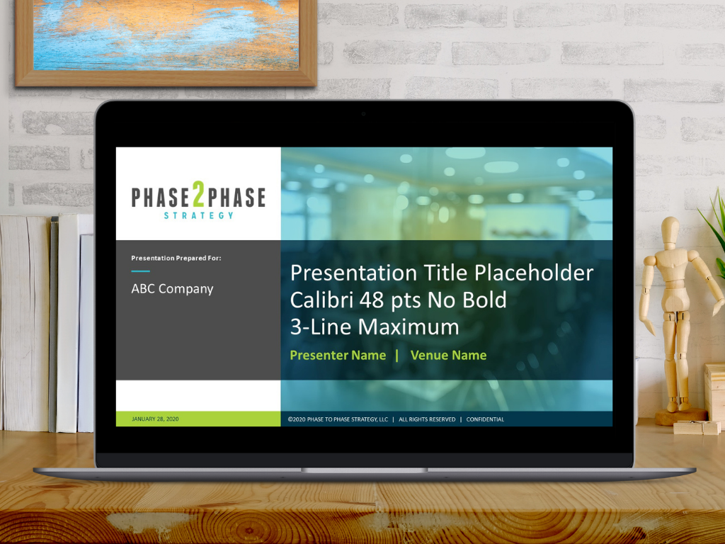
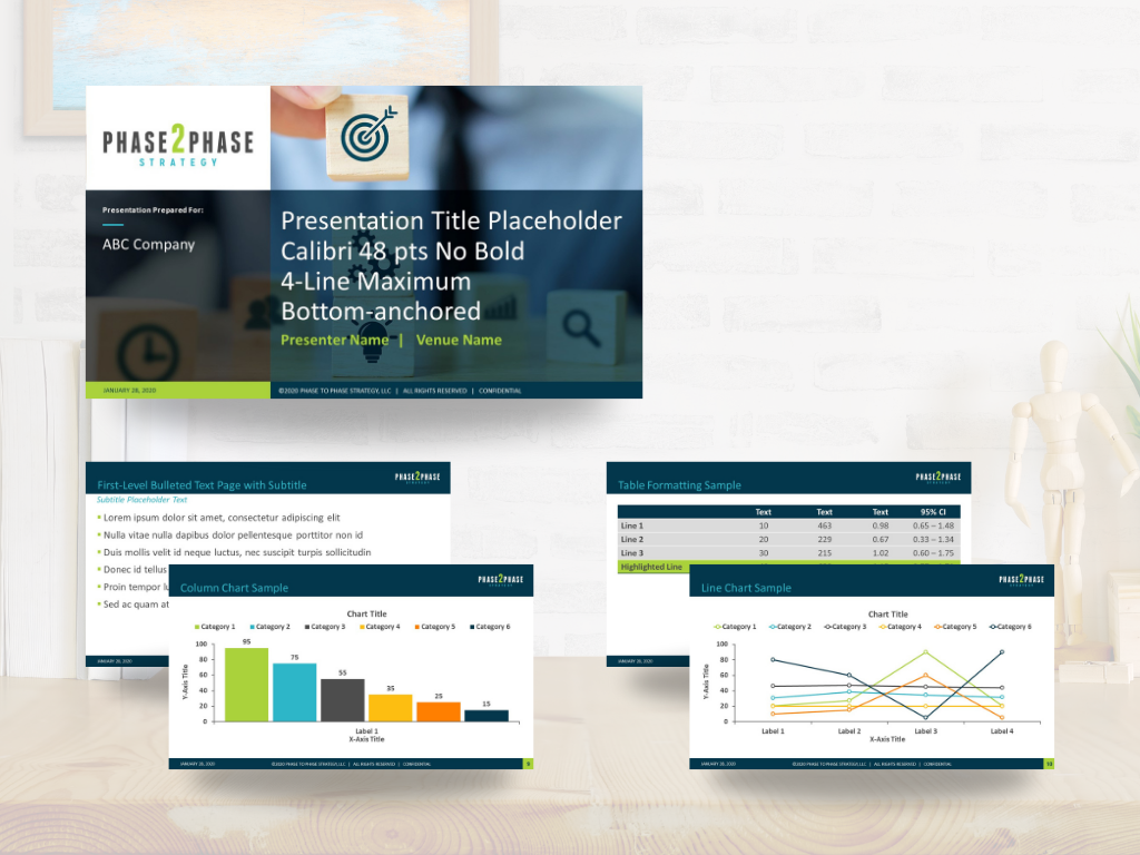
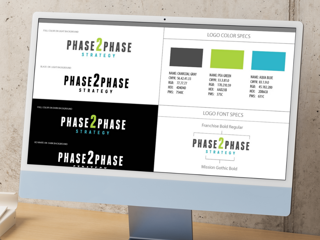
Phase2Phase Strategy, an agency of strategic and medical communications professionals serving the healthcare industry, approached iSpeak CREATIVE in need of a complete overhaul of its outdated branding and website design.
The primary goals were to establish a more elevated and enduring brand identity within the industry, while also expanding appeal to a broader client base. The branding strategy leveraged a suite of tools designed to convey a cohesive and immediate corporate image, positioning Phase2Phase Strategy as a seasoned, credible partner that embodies the strategic excellence it delivers to clients. Key deliverables included a logo redesign, refreshed brand color palette, website redesign, PowerPoint template, and a branded business card. A branded HTML email signature was also included, though not shown here. Below are a few highlights from the comprehensive rebrand. In the end, the client was thrilled, expressing sincere enthusiasm about how the rebrand revitalized the company’s overall brand presence.
Having worked with Miladys Cruz-Fisher previously at another medical communication agency, it was serendipitous and fortunate to catch up with her at a time my company, Phase2Phase Strategy, had an immediate need for updating of our branding and website. Accordingly, she and her creative team at iSpeak CREATIVE did a great job, demonstrating clear understanding of our needs, offering quality creative solutions, and providing excellence and efficiency in their implementation. Without a doubt, I would recommend Miladys and iSpeak CREATIVE for branding and creative solutions.
Mark Hansen
Founder and Managing Director
Phase 2 Phase Strategy
Connecticut Brace & Limb | Middletown, CT
DESIGN CHALLENGE / SOLUTION / OUTCOME
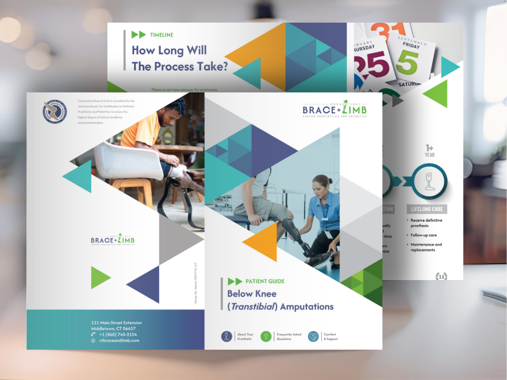
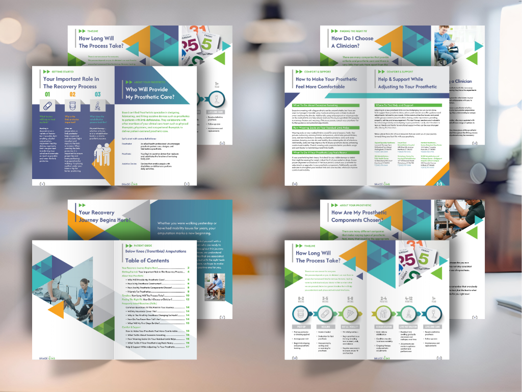
Tasked with creating a full branding package for a prosthetic limb provider, including a logomark, color palette, and supporting design elements for marketing collateral. The goal was to deliver a professional, approachable identity that would resonate with new amputees and healthcare professionals alike.
Several concepts were developed, each focusing on themes of strength, adaptability, and forward motion. The client ultimately chose a concept that cleverly incorporated a prosthetic leg as the “L” in the word “Limb.” This subtle integration of the product into the typography added a meaningful visual layer that reflected the company’s mission.
The branding was applied to a brochure aimed at recent amputees, with an emphasis on “movement” and “mobility” as uplifting, subliminal themes throughout the design. The client was thrilled with the result and felt the visuals communicated their brand message with both compassion and confidence.
Traject Sports & Performace | Port Chester, NY
DESIGN CHALLENGE / SOLUTION / OUTCOME
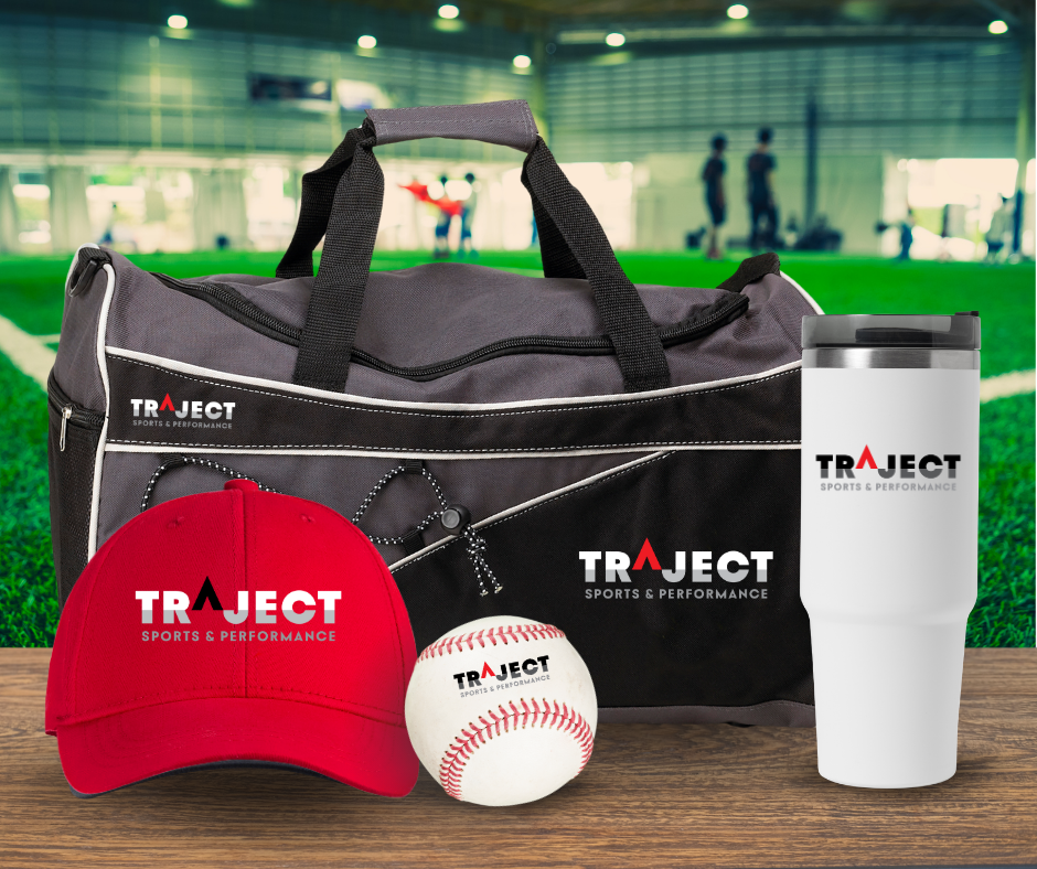
Tasked with creating the logomark for a 22k sq ft sports training facility focused on youth athletic development. The client wanted branding aligned with their equipment provider, Trajekt Sports, and a color palette limited to black, red, gray, and white to match sponsored baseball team uniforms.
With a tight budget and timeline, a few hours were spent researching competitor brands and the teen-to-young-adult target audience. Several concepts were explored, but only one was presented with a few variations.
The chosen concept features the “A” in “Traject” as an arrow, symbolizing upward growth. Its elevated position above the split line in the other letters represents rising “above the baseline.”
The client loved the direction and moved forward immediately. From concept to delivery, the entire process was completed in under a week. The final logo was later used by their website development team to guide the look and feel of their website.
Logo Gallery
Featured Branding & Packaging Project

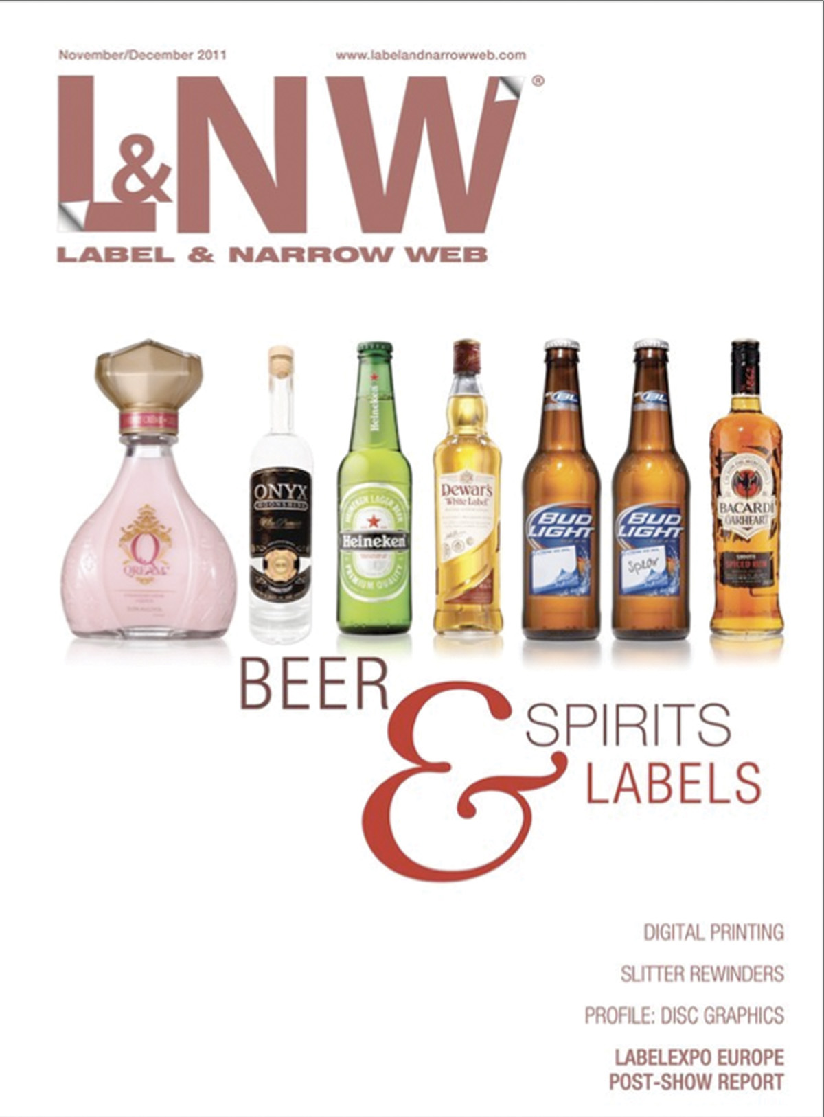
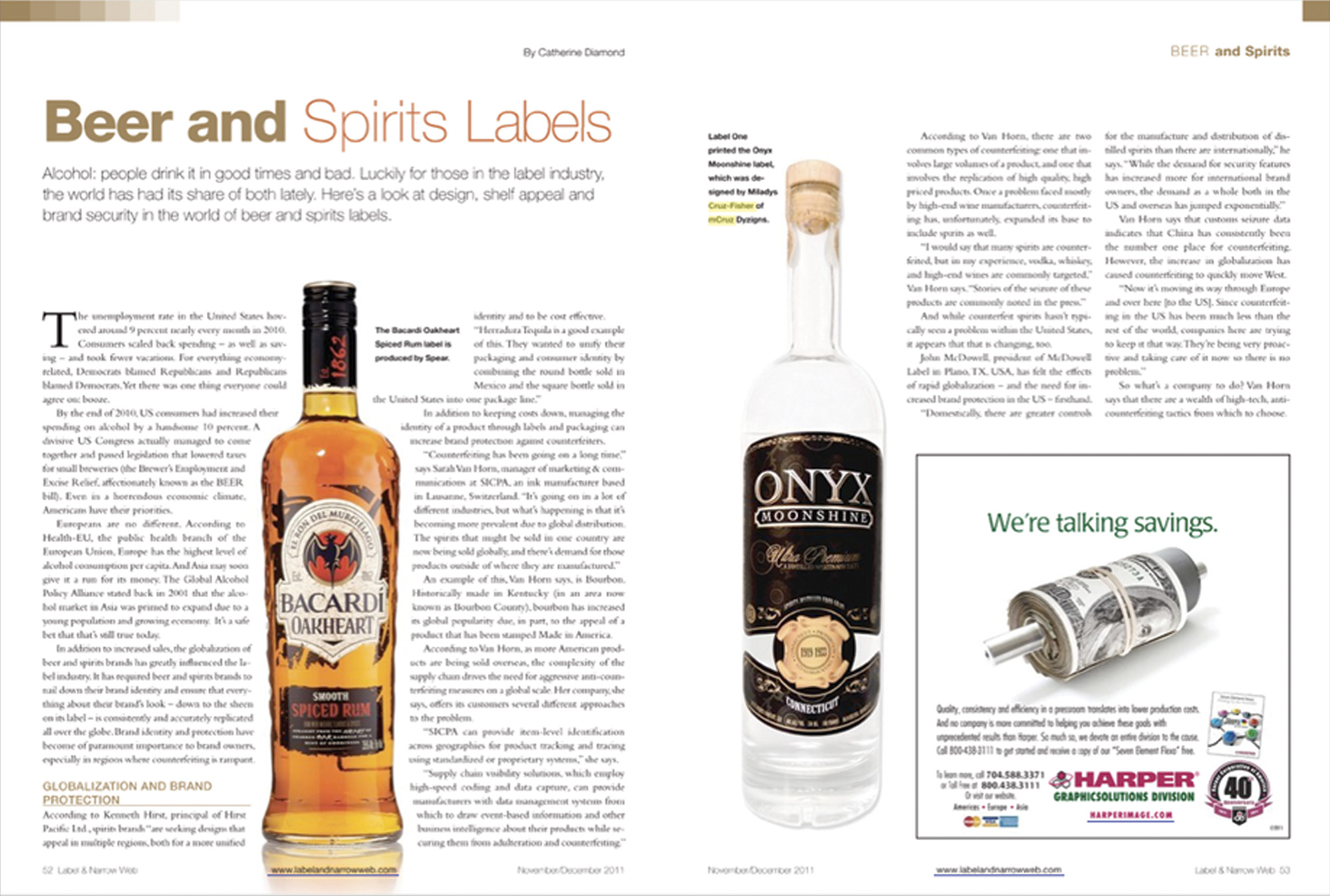
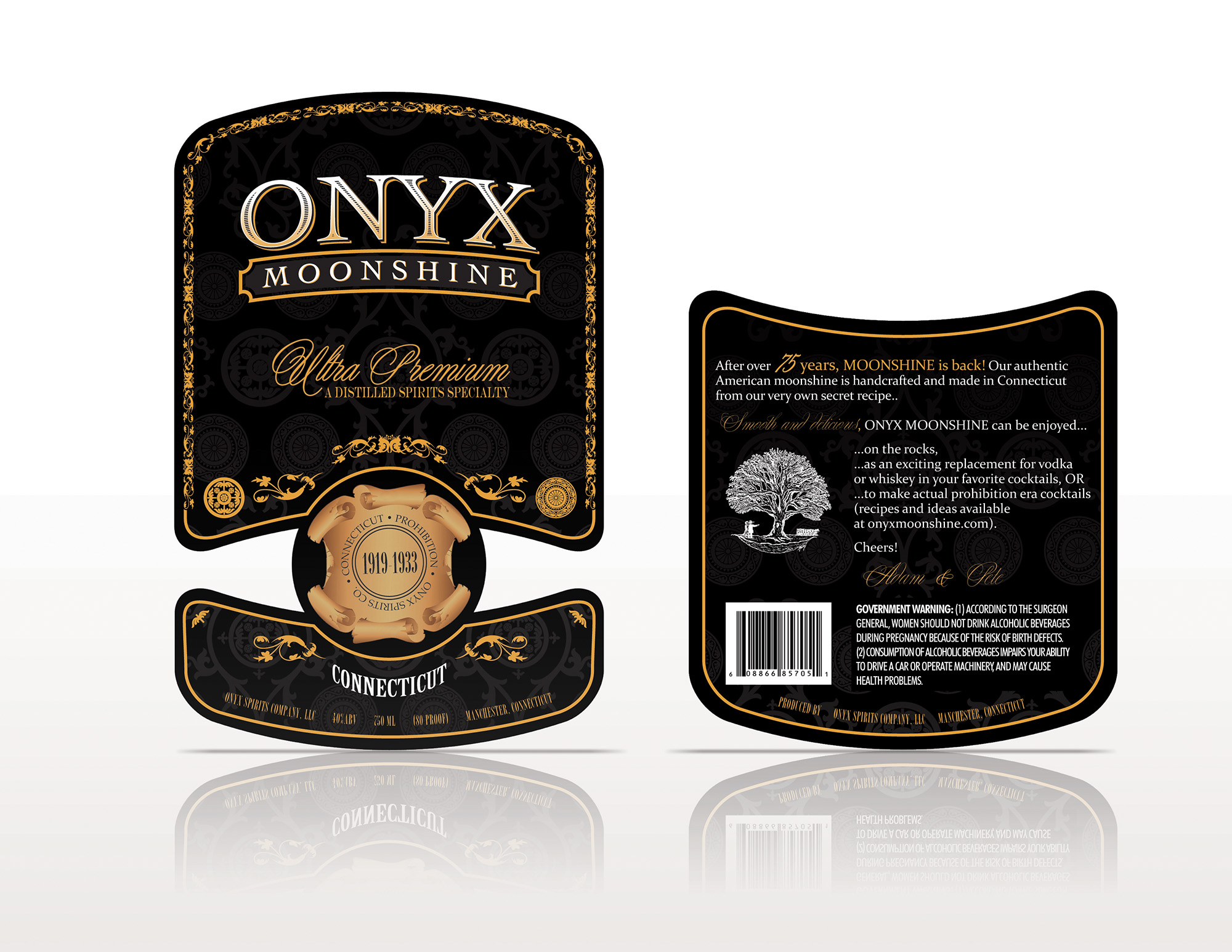
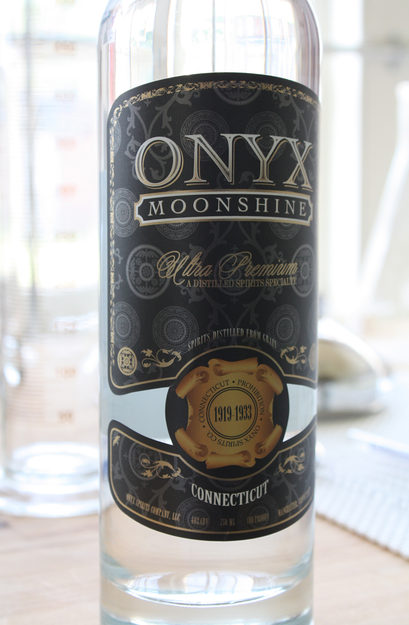
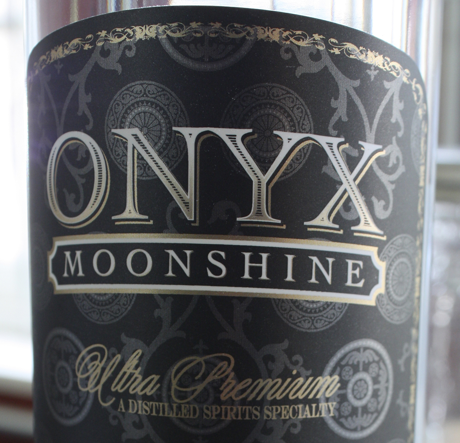
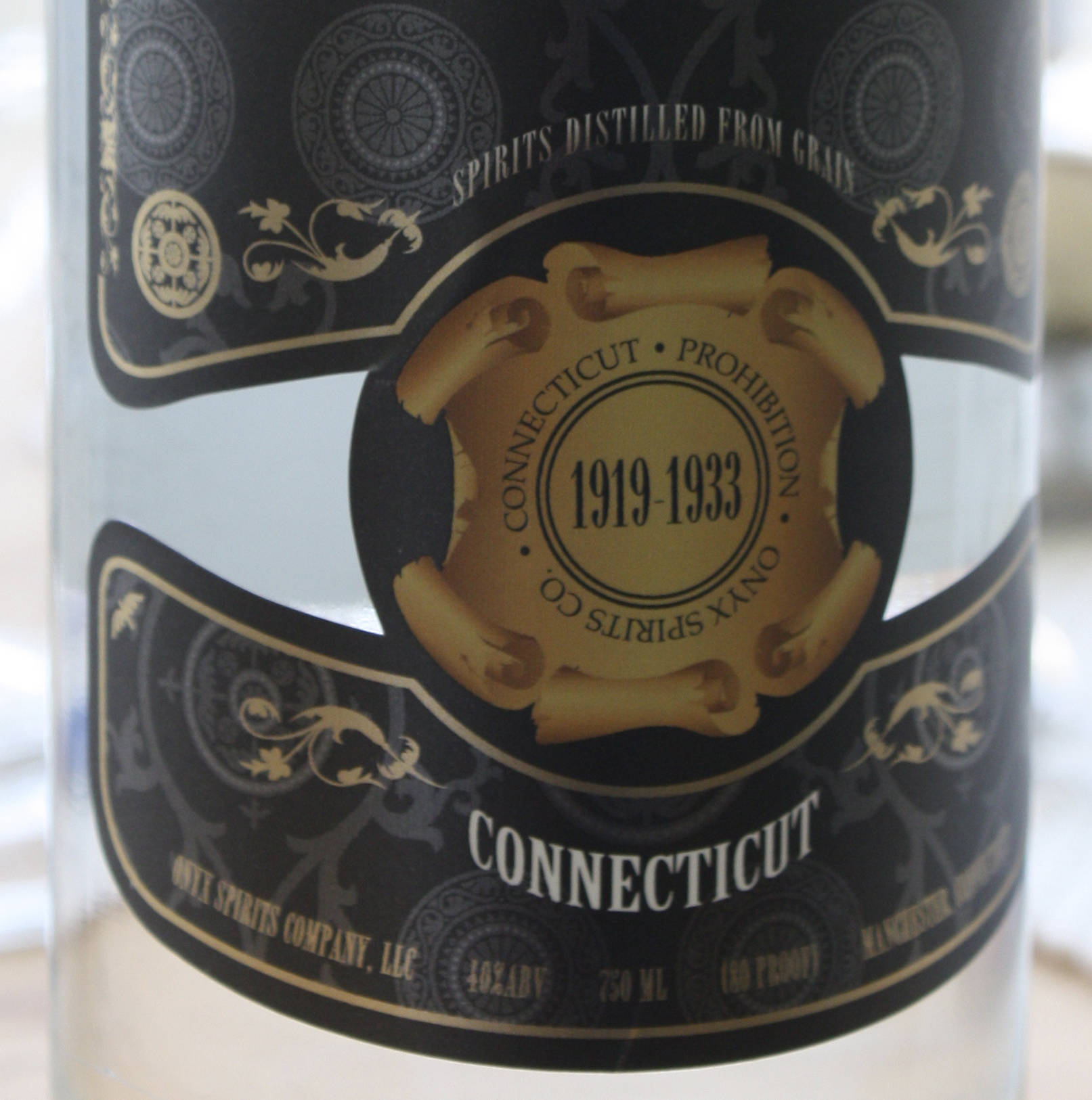
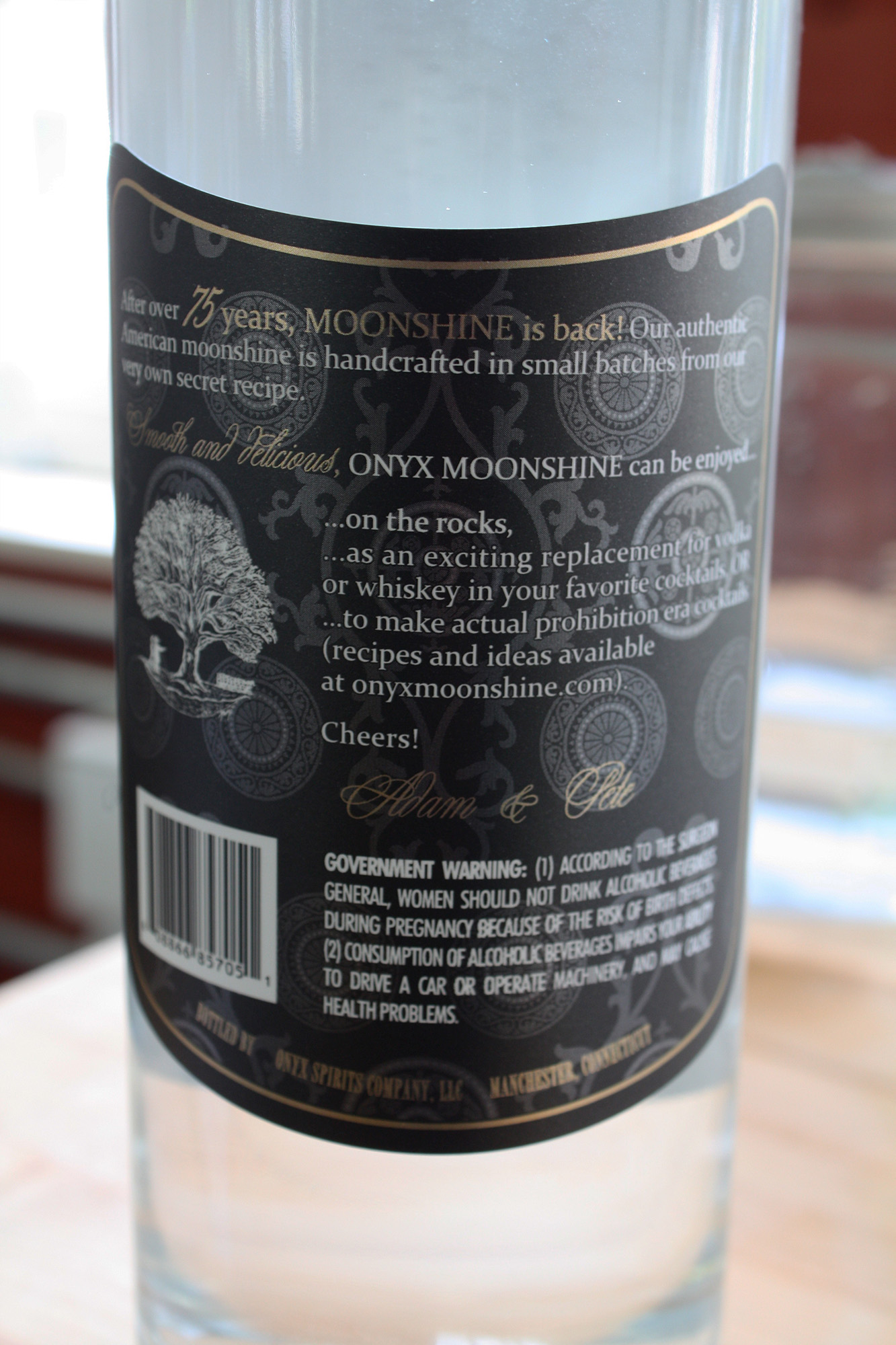
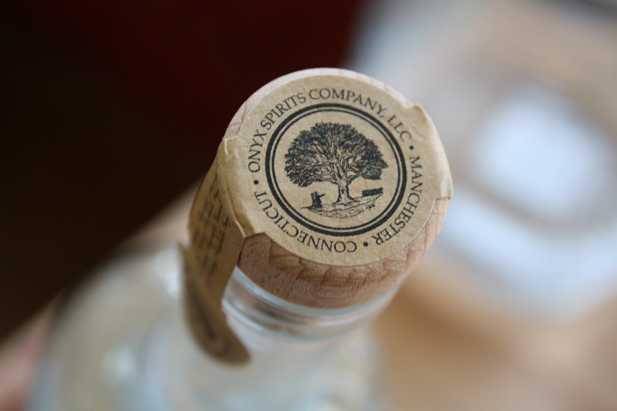
ONYX MOONSHINE
DESIGN CHALLENGE / SOLUTION / OUTCOME
After receiving over one hundred responses to their ad and conducting approximately twenty interviews, Onyx Spirits Company selected iSpeak CREATIVE for package design support for their new liquor brand product launch.
At the time, the young entrepreneurs were preparing to introduce Connecticut’s first legal moonshine since Prohibition. They sought a brand identity that balanced sophistication with a subtle nod to the Prohibition era, capturing the fun, risqué, and sexy spirit of the Roaring ’20s in a refined and timeless way. The design brief made it clear: no trendy gimmicks, just lasting elegance with a whisper of rebellion.
The logo for ONYX Moonshine was developed first, followed by the bottle labels. The final designs were well received and went on to be featured in Label & Narrow Web magazine. The product officially launched in September 2011 and gained early buzz after being included in celebrity gift bags at both the 45th Annual Country Music Awards® and the 54th Annual Grammy Awards®.
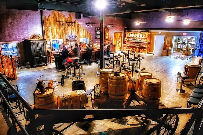
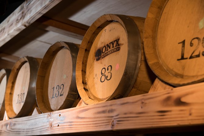
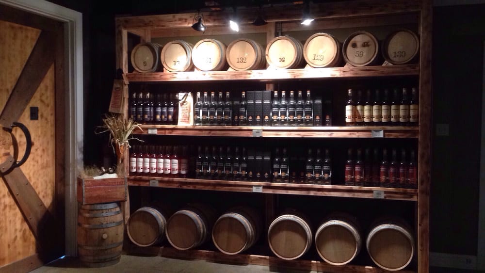
The success of the brand’s visual identity assets developed for the launch led to its expansion by their design team into the ONYX Moonshine Speakeasy Tasting Room in East Hartford, CT, bringing the brand’s aesthetic to life in a fully immersive experience.
Fun Branding & Packaging Project

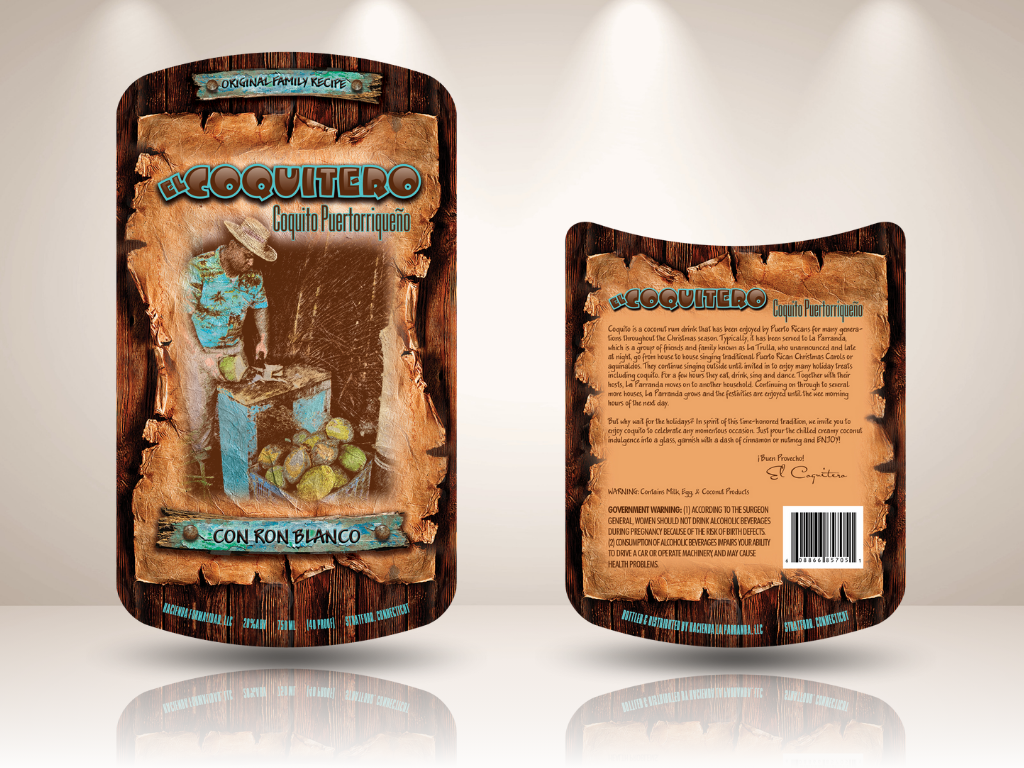
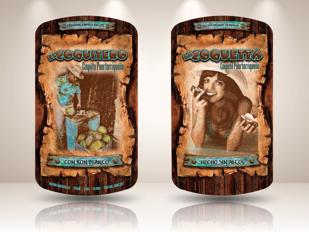
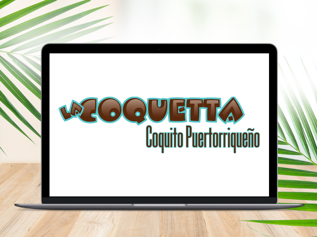
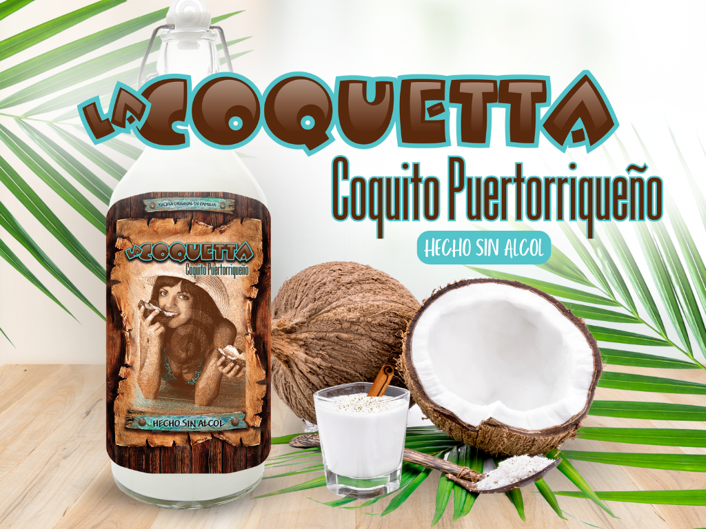
El Coquitero
CONCEPT / PASSION PROJECT
El Coquitero is a personal passion concept developed by iSpeak CREATIVE, inspired by Puerto Rican coquito, cultural tradition, and the idea of bringing a beloved homemade recipe to market one day.
The branding and packaging direction was designed to feel festive, flavorful, and polished, blending a sense of heritage with a bright, market-ready visual identity. The concept includes logo development, bottle packaging, and supporting brand visuals created to explore how the product could show up as a memorable specialty beverage brand.