
Phase2Phase Strategy: Complete Rebrand & Website Redesign
Phase2Phase Strategy: Complete Rebrand & Website Redesign
Phase2Phase Strategy, an agency of strategic and medical communications professionals for the healthcare industry, presented to iSpeak CREATIVE with a need for a major overhaul of its outdated branding and website design.
The overarching goals were to establish an elevated and enduring brand identity amongst industry peers while simultaneously appealing to a broader client base. The brand identity design approach included a variety of tools that cohesively served to create an immediate perceived corporate image and position Phase2Phase Strategy as an established competent partner that exemplifies the totality of the strategic recommendations passed on to clients. These tools included a logo redesign, brand color scheme, website redesign, PowerPoint template, and branded HTML email signature. Below are a few highlights of the major rebrand initiative. In the end, the client was elated and expressed sincere enthusiasm about the rebranding campaign related to how it has revitalized the company’s brand presence.
1. Logo Design & Brand Color Scheme
Logo Design
BRAND LOGO ASSETS
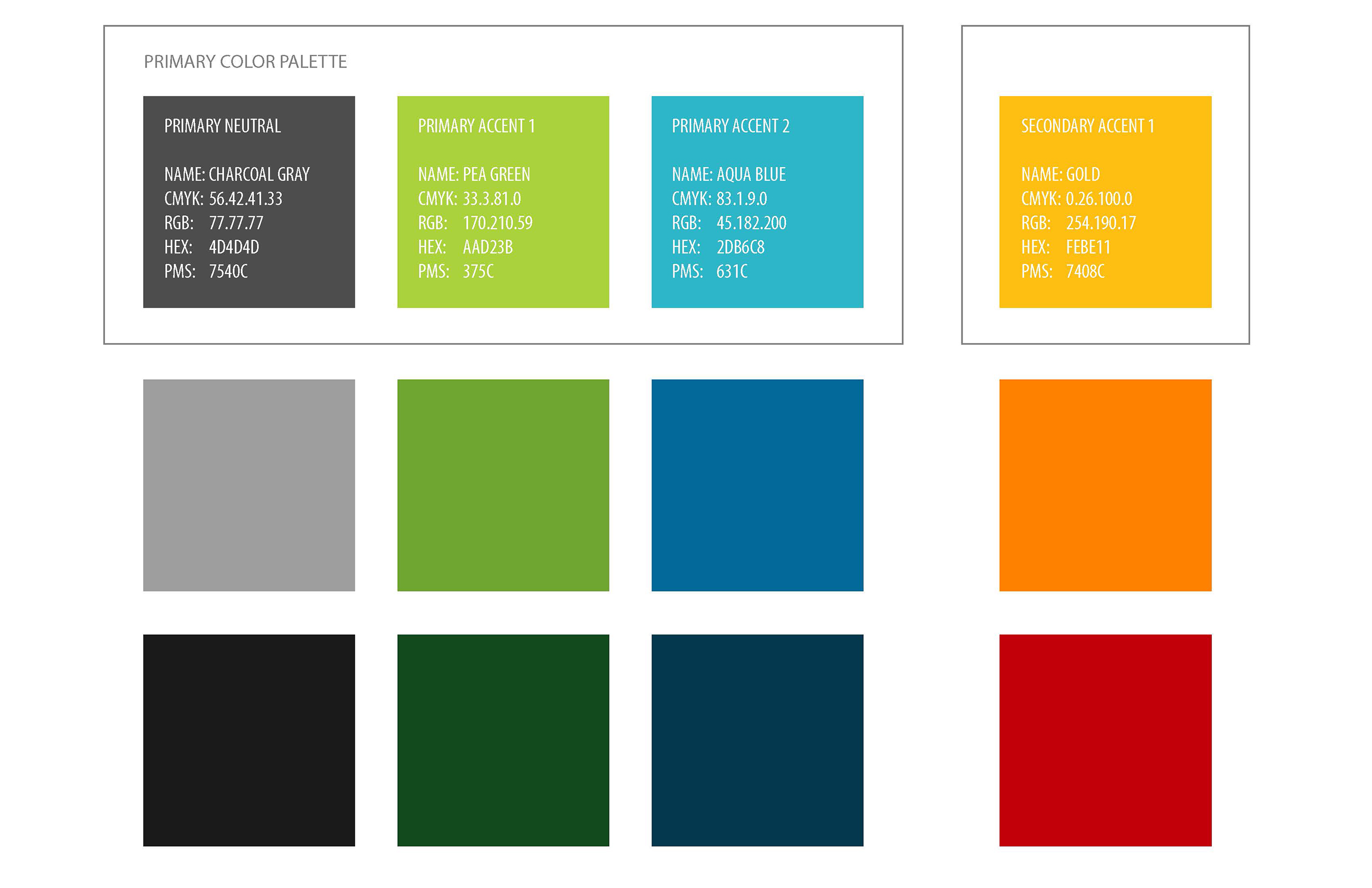
Brand Color Scheme
2. Website Design
1-Page Website
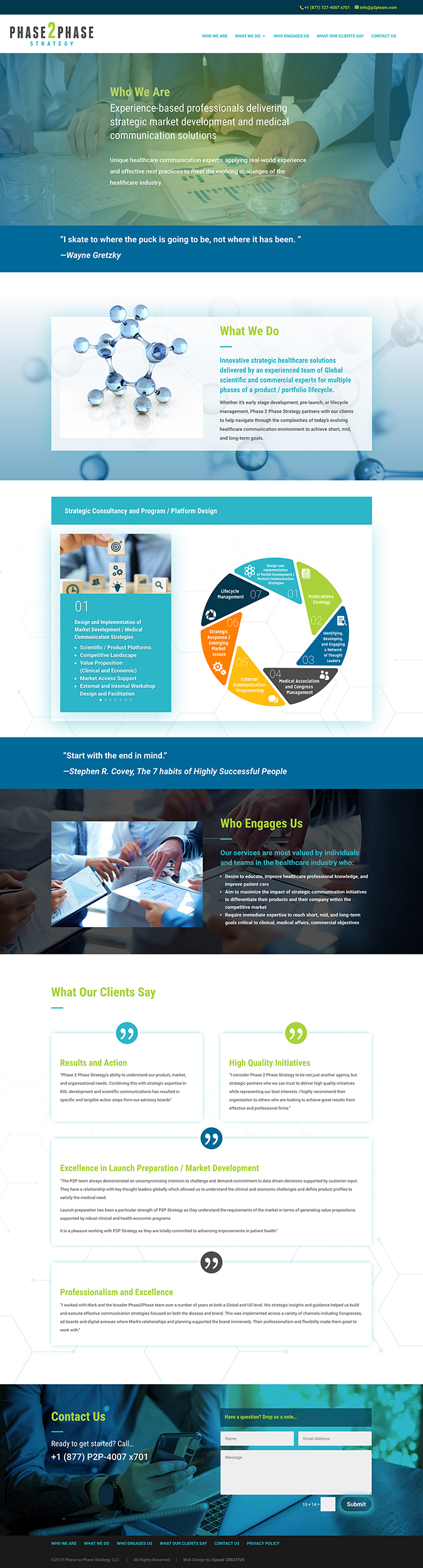
Once a logo mark was developed and a brand color scheme finalized, the next step was to tackle the redesign of the Phase2Phase Strategy website. The main objective of having a web presence for Phase2Phase Strategy is to reinforce the perception that the company is a credible and established entity that is highly qualified as a strategic partner to potential clients. Therefore there was not a justifiable need for a comprehensive website with multiple pages and extensive content. Ultimately, it was determined that a 1-page website with a navigation menu that scrolled to specific section anchor points would suffice to satisfy the objective.
Website Section Details
Recommendations by iSpeak CREATIVE: Even though the “less is more” approach was paramount with this website project, it was our recommendation to build it using a WordPress content management system (CMS) with a Divi theme. This affords the client the ability to expand upon this website in the future should the objectives change and a more comprehensive website be necessary.
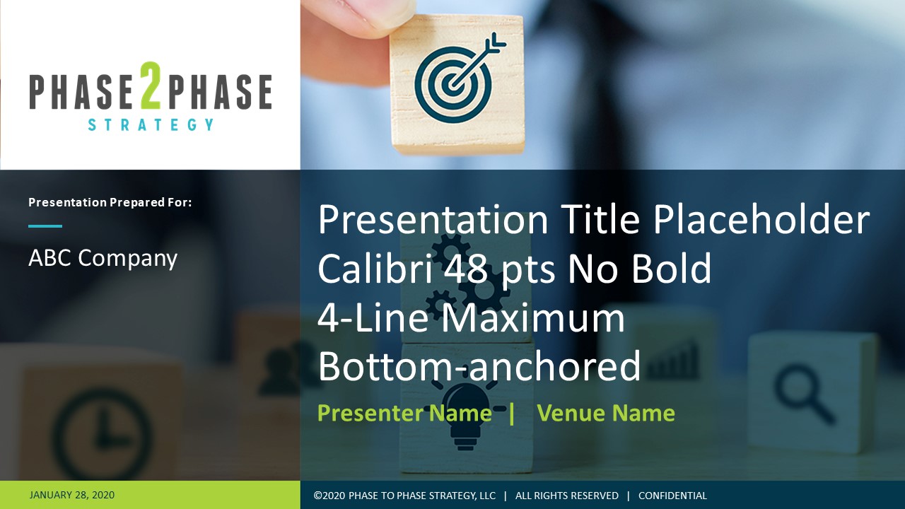
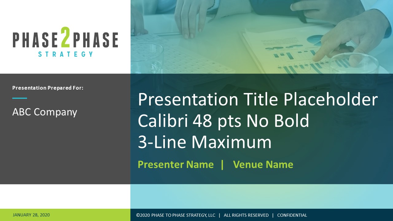
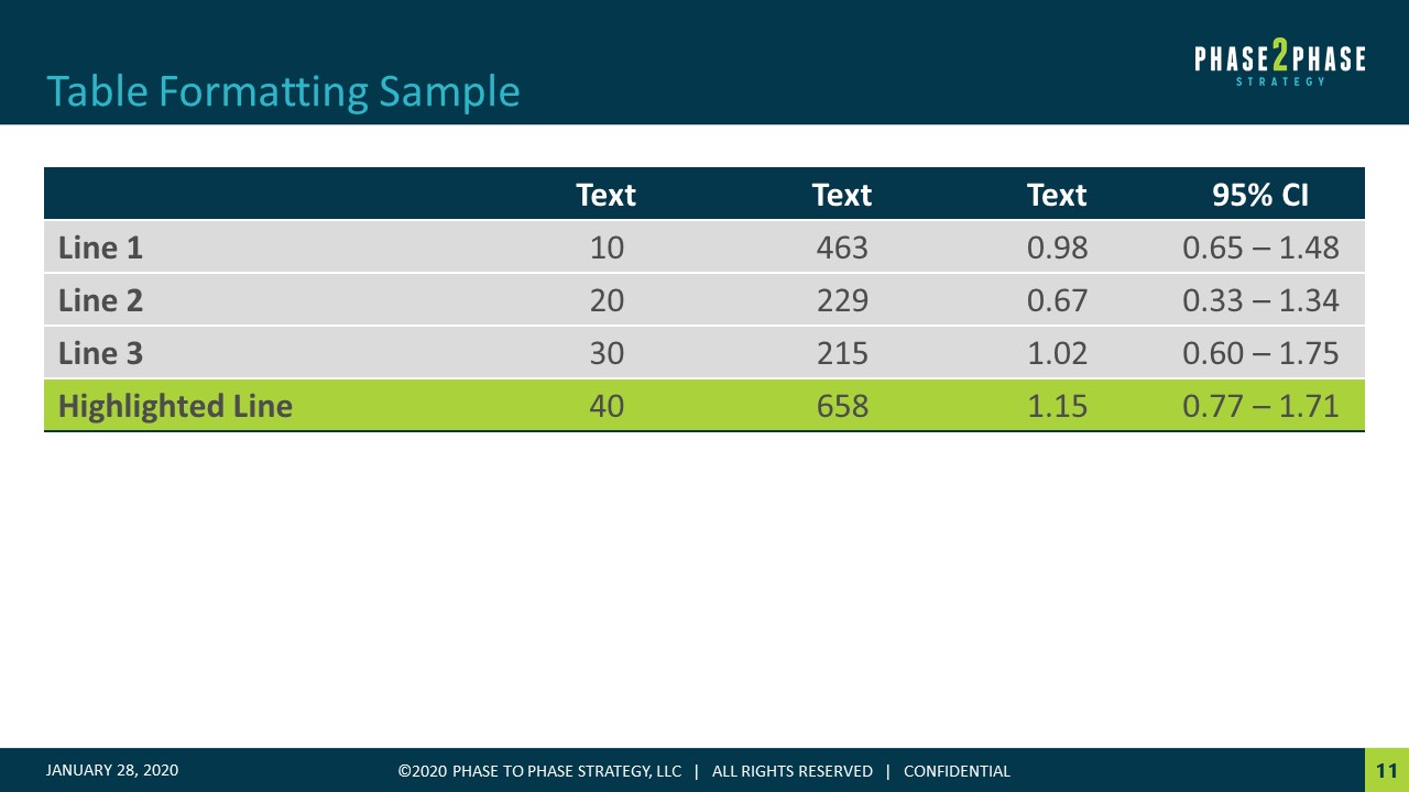
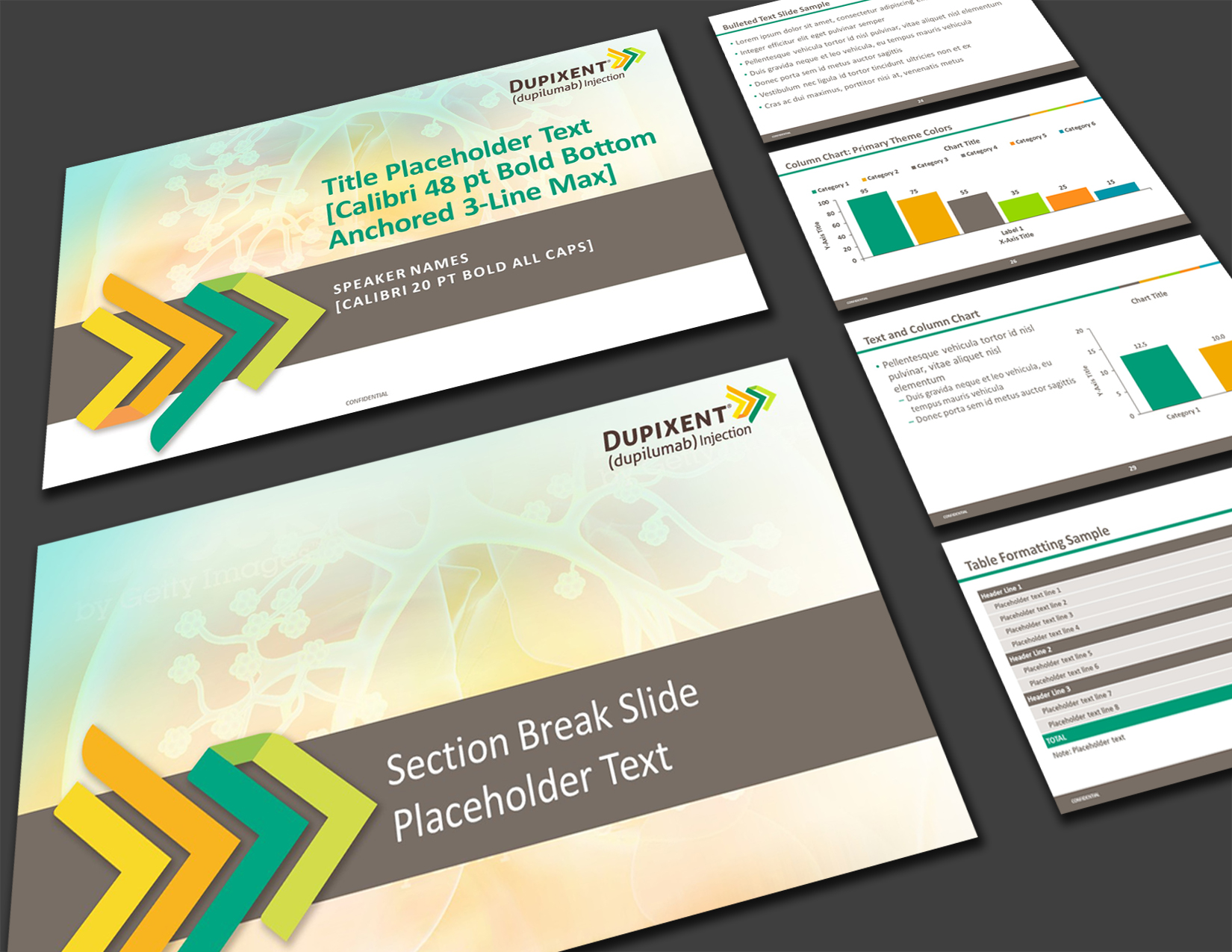
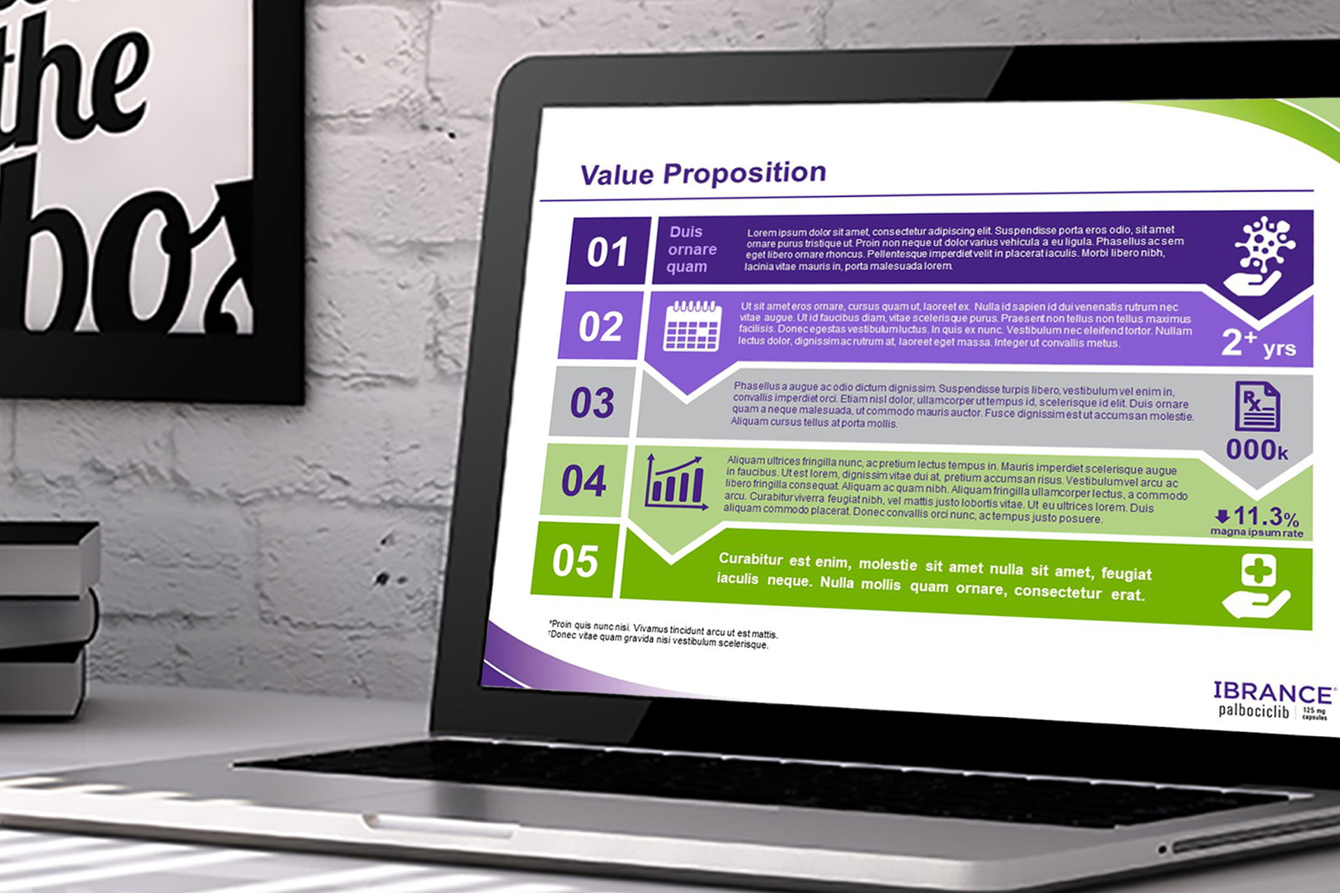
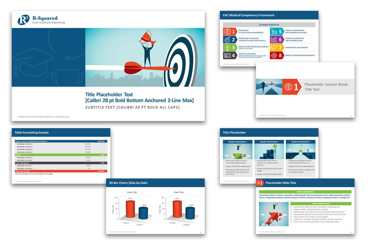
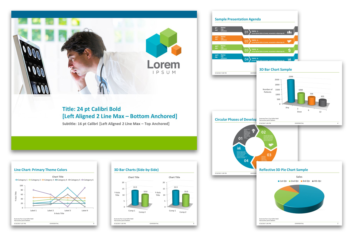
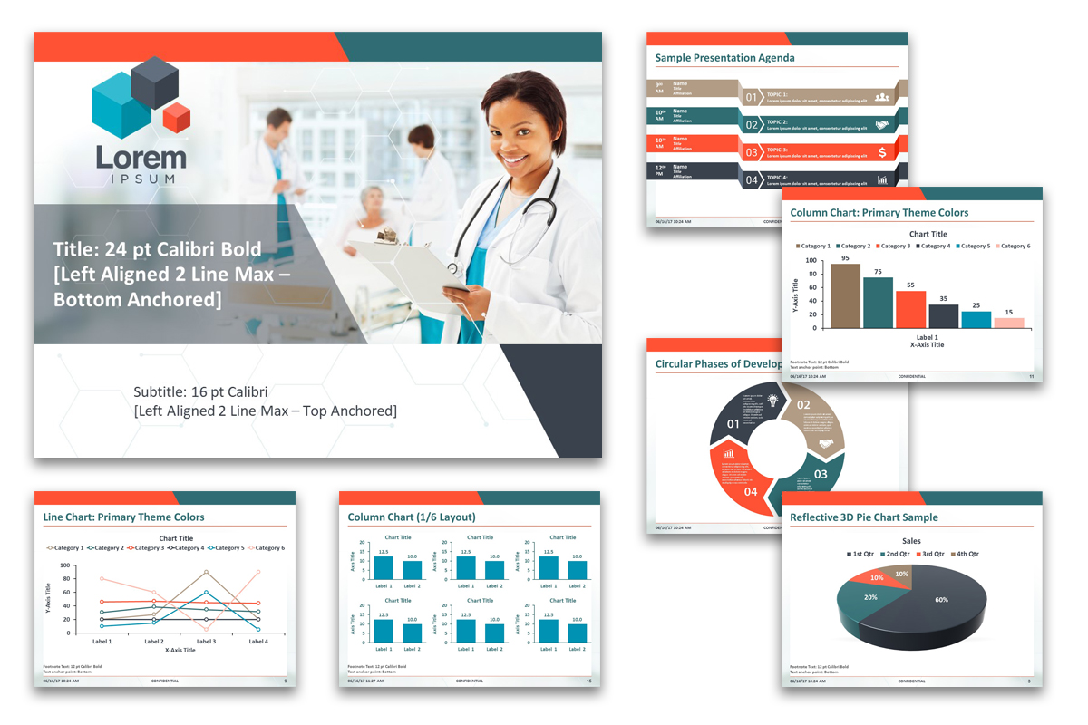
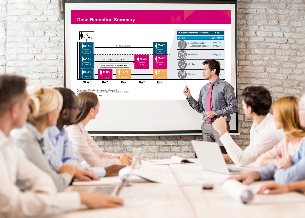
3. PowerPoint Template Design
Other Creative Highlights
Other Creative Highlights
PowerPoint Presentations
iSpeak CREATIVE can create custom PowerPoint templates that work within established brand design parameters or start from scratch to create a company brand color scheme/style and then tailor presentation templates accordingly. The graphic styling and formatting are carefully considered for optimal clarity and legibility in both VBA display or projection environments but will still print clearly in either color or B&W.
Logo Work
DPS required an entirely new brand identity that encompassed the design of a new company logo and brand color scheme. Once the logo was finalized and the brand identity established, additional logos were developed for a DPS client platform interface called the DPS Navigator that incorporated other product offerings such as SlideCENTRAL and WorkBook Pro.

Podcast Cover Design
This was such a fun design to work on and is a composite of several images that took roughly 12 hours to complete.
SNIPPET FROM DESIGN BRIEF:
“Robotic Disclosure” is a first-of-its-kind program that will feature administrative, clinical, and industry leaders examining the real-world impact of surgical robotics on hospitals in the US and around the world.
Design should be intriguing with a distinctively robotic / surgical look, but with a clear overtone of investigative journalism.
OUTCOME:
The design was well received by the client who was excited to use it for their podcast.
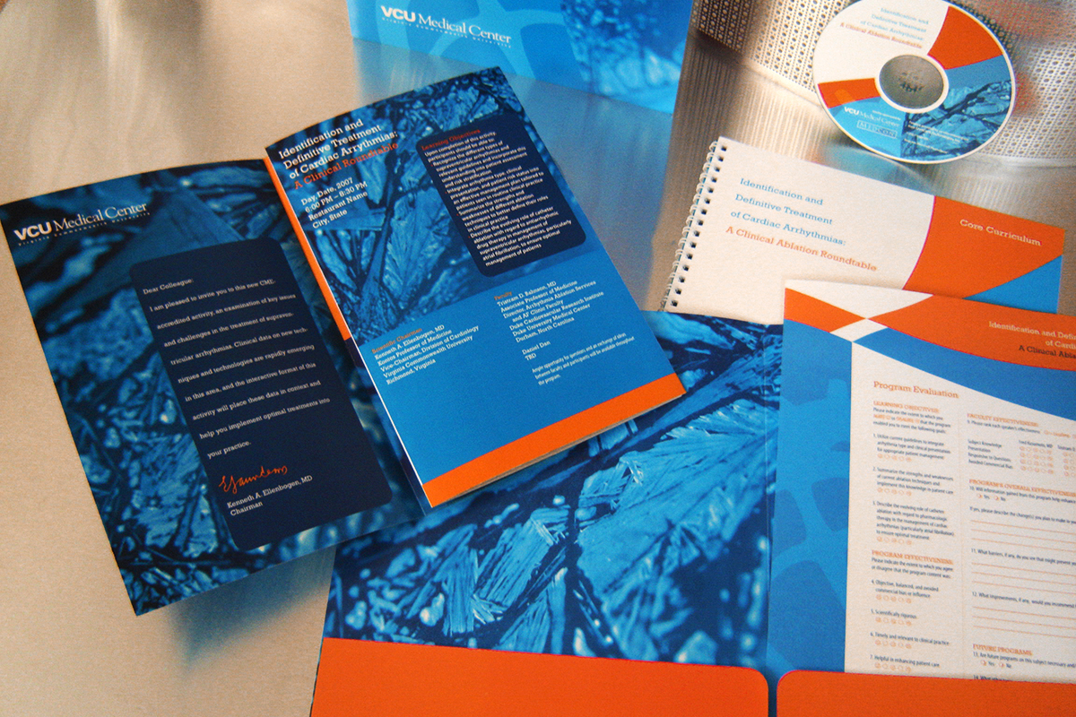
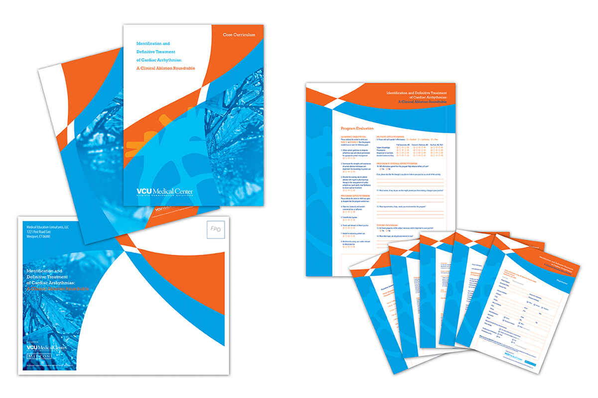
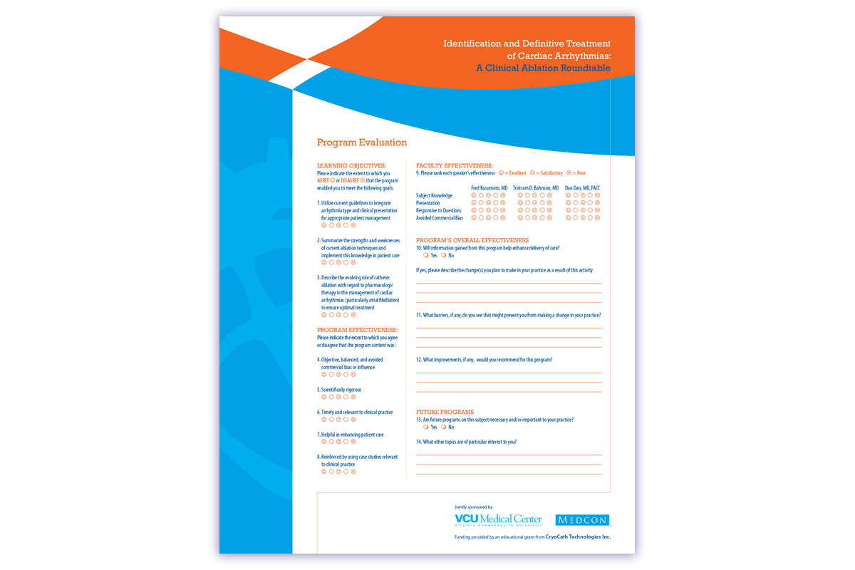
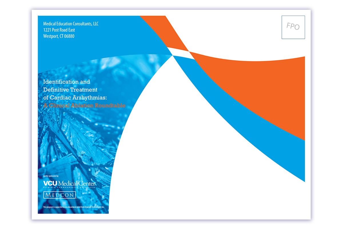
Medical Education Program Package
This eye-catching program package surrounding the therapeutic topic of CryoCath Ablation Therapy, was mass mailed to its recipients and included a larger outer envelope, a 9″ x 12″ folder, an intro letter, a tri-fold program brochure, and several questionnaire forms. It was reported that the attendance turnout to the event was an overwhelming success!
Medical Education Program
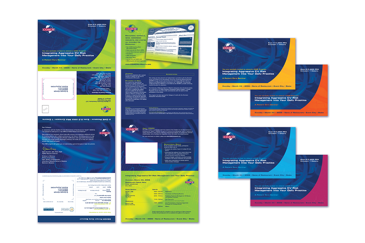
& Direct Mail Invite Series
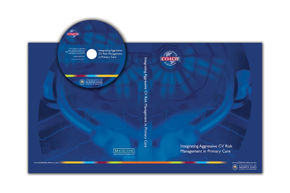
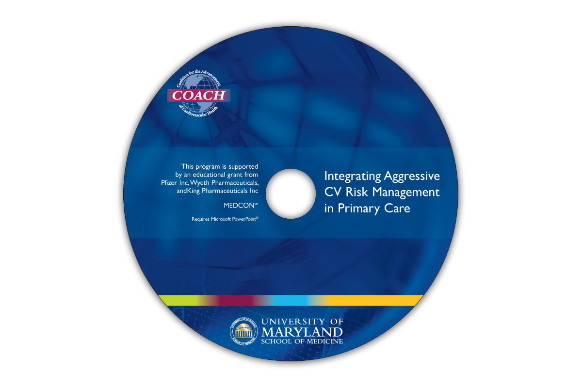
This Continuing Medical Education (CME) project geared towards cardiologists, was designed to accommodate support material for an accreditation seminar regarding the topic of cardiovascular risk management and included a thick glossy
3-ring binder and CD cover label. Preceding the event was an
8-panel gatefold direct mail invitation that incorporated a response card panel. Since this initiative was a multi-part program series, a color-coded design was built into the theme. The invitation was strategically designed with a die-cut window opening for recipient addresses. This allowed for a single print pass process versus a double pass. With output quantities in the hundreds of thousands, this seemingly minor detail allowed the client to save well over $7,500 in production costs; a true testament of how a bit of time invested for strategic design planning up front can translate into quite a bit of money saved in the end.
I Love Working With Creative Minds
If you are interested in working together, send us an inquiry and we'll be in touch soon!